User interface design has continuously evolved alongside advances in hardware and computing. Every major shift in technology has introduced new expectations for how digital products should look, feel, and respond to users. As rumors continue to circulate about Apple’s next generation of operating system designs, many designers are asking the same question: what comes after today’s minimalist interfaces?
The answer may not simply be another visual refresh. Instead, the next era of interface design could focus on making digital elements behave more like physical objects. Rather than relying only on colors, icons, and animations, interfaces may increasingly simulate real-world materials, movement, and depth to create experiences that feel more natural and intuitive.
Looking back at Apple’s design history helps explain how the company has repeatedly redefined user expectations. The original iPhone introduced an interface filled with familiar textures, shadows, glossy buttons, and realistic illustrations. These visual details weren’t added simply for decoration. They helped users transition from physical devices with mechanical buttons to an entirely touchscreen experience. The familiar appearance reduced uncertainty and made digital controls easier to understand.
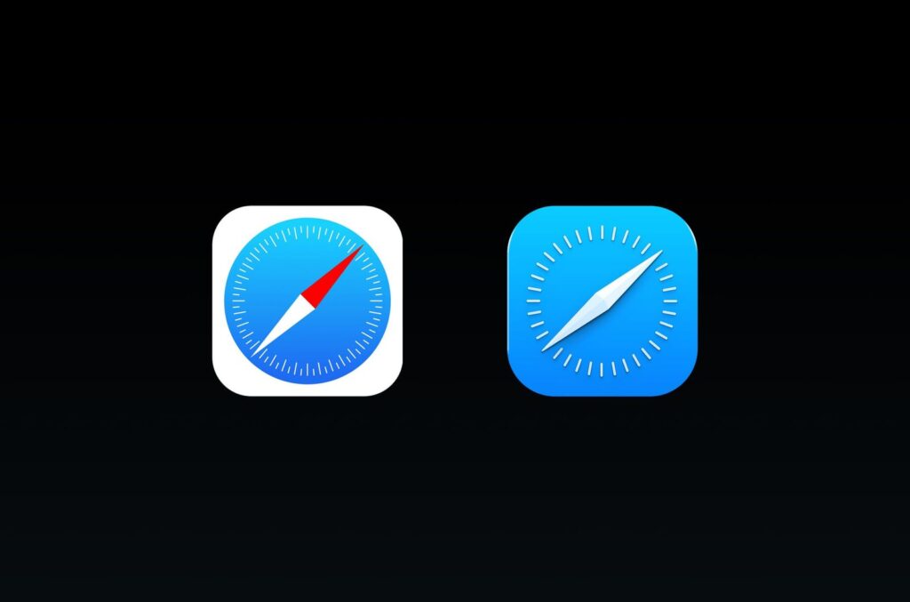
As people became more comfortable with smartphones, those realistic visual effects gradually disappeared. Apple’s introduction of flat design emphasized simplicity, typography, and clean layouts instead of decorative textures. Buttons became lighter, icons became simpler, and the interface shifted toward clarity rather than imitation. Although many visual embellishments vanished, the system introduced subtle depth through motion, transparency, and layered effects instead of static shadows.
Over time, even flat design evolved. Rounded corners, refined typography, softer colors, blur effects, and adaptive animations slowly reintroduced visual depth without returning to the heavily textured interfaces of the past. The result was a cleaner design language that remained modern while becoming easier to navigate.
Today, another transformation appears possible. Advances in processing power, display technology, and graphics rendering allow operating systems to create interfaces that react dynamically instead of relying on fixed visual effects. Apple’s work on spatial computing has already demonstrated how digital elements can exist as if they occupy real space.
In visionOS, interface components are designed with convincing physical qualities. Windows appear to have thickness, materials respond to lighting conditions, and shadows help establish depth. These elements don’t merely resemble physical objects—they behave as though they exist within the surrounding environment. This philosophy creates a stronger connection between digital content and the physical world.
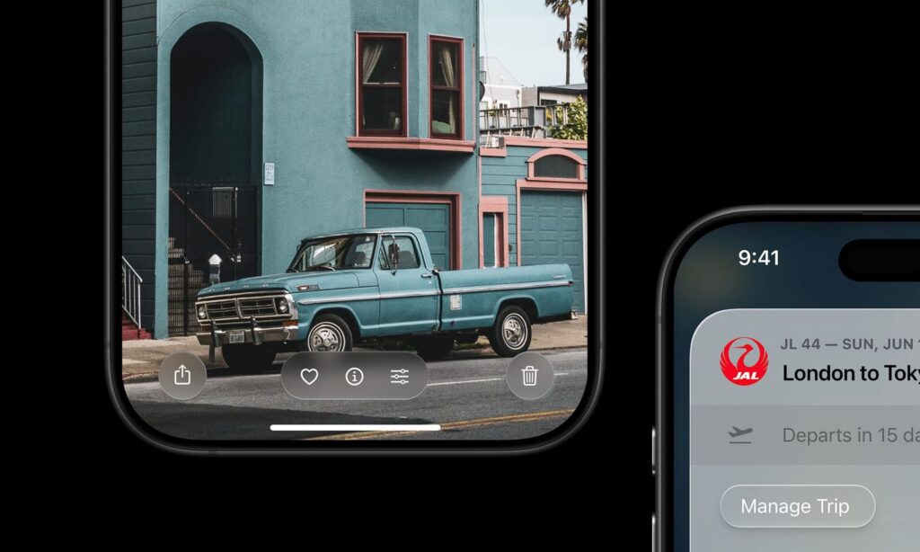
Many of these concepts have already started appearing across Apple’s existing platforms. Features such as Dynamic Island, modern notification animations, and Siri’s latest visual effects demonstrate interfaces that stretch, merge, expand, and respond with lifelike movement. Rather than appearing as static graphics, these elements feel almost fluid, reacting naturally to user interaction.
This approach represents a new interpretation of realism. Earlier interface design attempted to imitate real-world objects through detailed textures and illustrations. Modern interfaces can instead reproduce physical behavior. Motion, elasticity, lighting, transparency, and material response become more important than visual imitation alone.
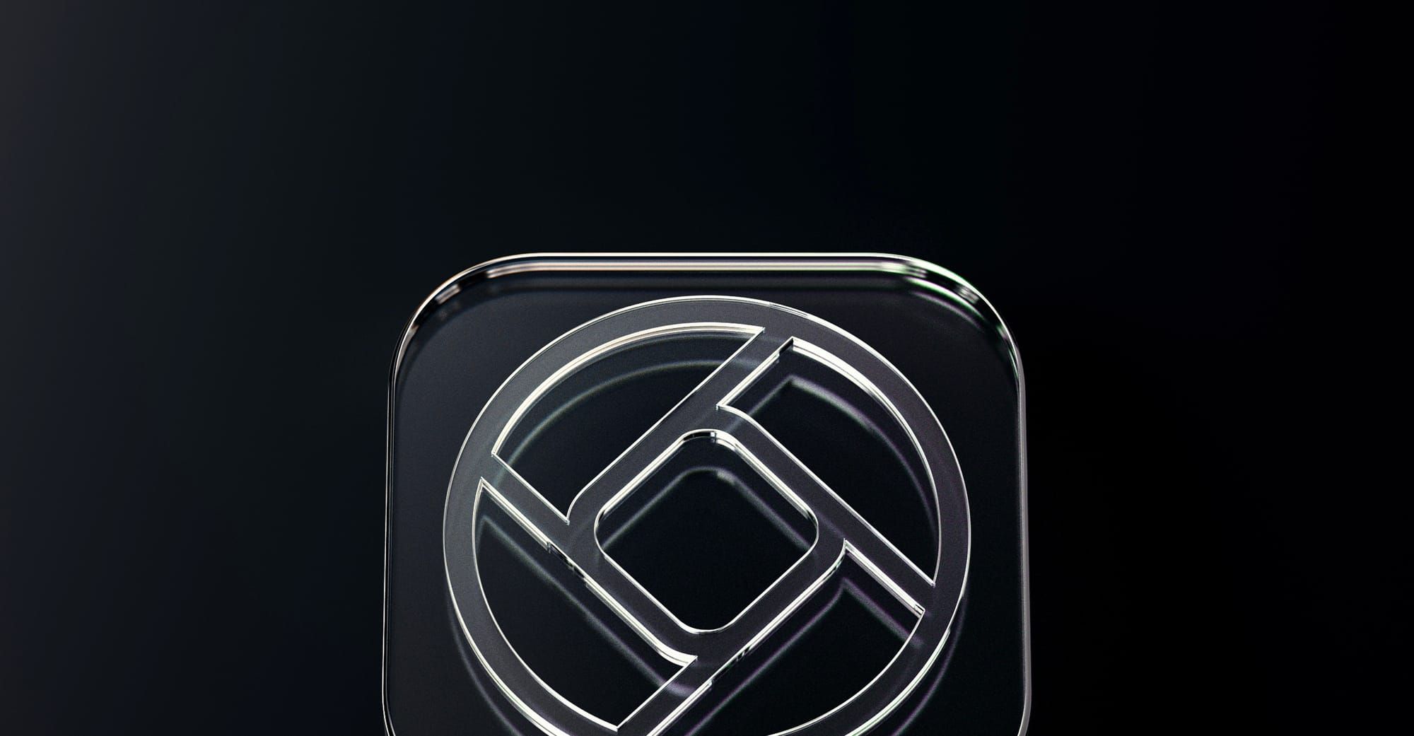
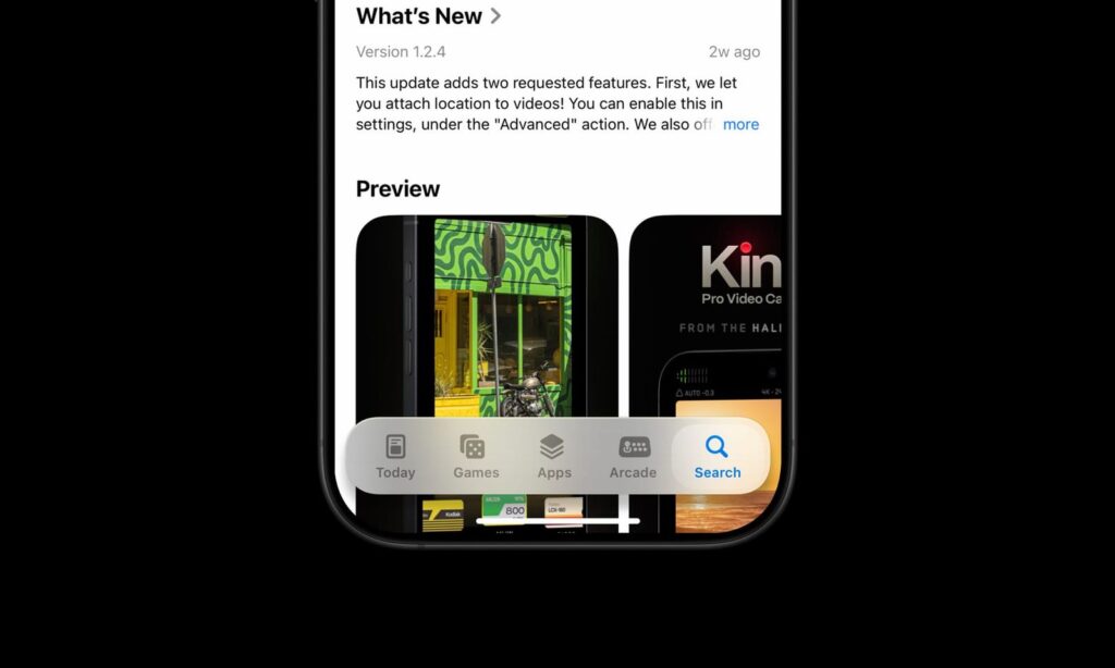
One possible direction for future operating systems is the widespread use of glass-inspired interface materials. Since nearly every Apple device already features a glass display, digital controls could visually reinforce that physical connection. Buttons, panels, menus, and navigation bars might appear translucent, reflective, and responsive, giving the impression that the display itself has become interactive.
Unlike traditional transparent panels, these elements could adapt continuously to their surroundings. Reflections might change depending on displayed content, lighting effects could shift as colors move beneath them, and subtle highlights could reinforce depth without distracting users. Rather than overwhelming the interface with excessive visual effects, these materials would remain understated while adding realism.
Navigation components may also evolve significantly. Instead of permanently occupying screen space, toolbars and tab bars could float above content, appear only when necessary, and gracefully transition as users scroll. Such behavior would maximize available screen space while keeping essential controls easily accessible.
Buttons may receive varying levels of emphasis depending on their importance. Primary actions could appear elevated with stronger material effects, while secondary controls remain integrated into surrounding surfaces. This hierarchy would naturally guide user attention without relying solely on color differences.
Application icons also seem likely candidates for redesign. Current icon systems already support flexible rendering across different themes and display modes. Future versions could introduce layered materials, subtle reflections, animated lighting, and greater consistency across the operating system while preserving the recognizable identity of existing apps.
The home screen itself could experience its largest transformation since the original iPhone. Artificial intelligence may play a larger role by presenting contextual information, suggesting relevant apps, or organizing content dynamically based on user habits instead of relying entirely on manually arranged grids.
Interactive components such as sliders, media controls, and notification panels may increasingly respond to surrounding content. Blur, reflections, lighting, and color could shift automatically depending on what appears beneath them, making every interaction feel connected to the overall interface rather than isolated from it.
These changes would extend beyond operating systems alone. Apple’s design language has historically influenced its websites, marketing materials, retail environments, and product packaging. A new visual philosophy centered on responsive materials could naturally appear across every customer touchpoint, creating a more unified brand experience.
Such a transition would also reshape the way designers build digital products. Instead of manually creating static visual assets, designers would increasingly define behaviors, materials, lighting responses, and interaction rules while allowing the operating system to render many visual effects automatically. This shift could provide greater consistency while giving developers more powerful tools for creating immersive experiences.
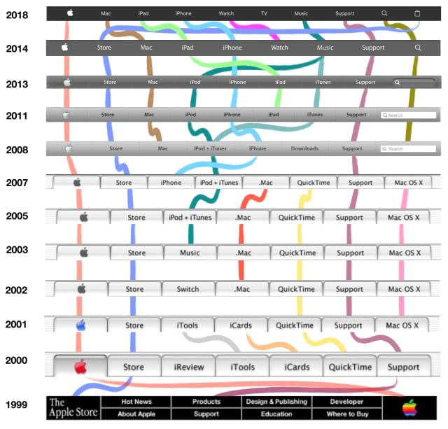
The evolution of interface design has always reflected changes in both technology and human expectations. Early interfaces focused on familiarity, flat design prioritized clarity, and modern systems introduced adaptive behavior. The next stage may combine these lessons by creating interfaces that are visually simple but physically expressive.
If this direction becomes reality, future user interfaces will no longer feel like collections of static controls placed on a screen. They will behave like responsive materials that react naturally to touch, movement, light, and context, making digital interactions feel increasingly seamless and alive.